What could be more important these days for a business than their website? For many, if not most, the website has become not just a virtual storefront, but really their only storefront. I know that for my organization, Operation Groundswell, our home on the internet is the primary place that anyone gets their information about us. It's their one stop shop to discover what we do, explore our programming, learn about financial options, and ultimately apply to join us overseas. That's why we made sure to invest both our time and money in creating something that truly speaks to who we are as an organization and the importance of the work that we do at home and abroad.

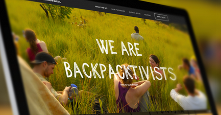
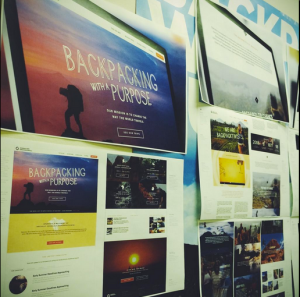
Earlier this month, we launched our beautiful new website at operationgroundswell.com. A stunning new look that captures the ethos of our organization, clearly elaborates on what it means to travel ethically and volunteer responsibly, showcases the experiences of our alumni through visuals, and really just makes you wanna strap on your backpack and hop on a plane to anywhere.
It was a HUGE proejct and one that I am incredibly proud to have spearheaded. I thought I'd share some of my biggest takeaways...
1. Your team is everything. I've worked on a website redesign only once before, but only on the periphery and that was back when I was just a summer student in university. This time around I was at the forefront leading it and bringing together a diverse team of designers, developers, and SEO experts. I had no real experience in this sort of project nor any real sense of what goes into the process, but having a solid team of self-starters is what made all the difference. Our designers and developers at Loop: Design for Social Good are actually magicians and our SEO consultant Michael Gordon is a no-nonsense perfectionist that always gave us the straight goods. Our head office team at OG is also a wicked mix of meticulous role jugglers that helped with a wide range of tasks from troubleshooting technical issues with our server host right down to painstakingly editing the copy on the website (all while doing their "normal" jobs in finances, program development, and/or fundraising).
 2. A three-month timeline to completely redesign an organizational website complete with SEO and mobile optimization is incredibly ambitious. We all knew that going in, but we went for it anyway. To go from brand analysis to design conceptualization, from development to testing in three months is a huge stretch (some may even say unrealistic). Throw into that mix SEO training and implementation and you're pretty much right on the edge, if not completely over it. Don't do this unless you absolutely have to. You will lose lots of sleep and it will be very, very stressful.
3. But if you hustle hard and have a dynamic team, you'll pull it off. It really all comes down to your team and your collective determination to see this project through. Admittedly, we missed our target date by fifteen days but given the size and scope of this project, I will still give ourselves a pat on the back because that's still pretty damn close. Bottom line, ANYTHING IS POSSIBLE.
4. Communicate effectively and frequently...even if you feel like a nuisance! Working with external contractors requires an extra effort to effectively communicate their responsibilities, as well as your expecations and timelines. It's one thing for me to work with our crew at head office who I see every day and whose working styles I've grown accustom to, it was an entirely other thing to communicate and coordinate with external designers and consultants. Even with a really phenomenal team, it was a challenge to stay conscious about openly collaborating and keeping all lines of communication as free flowing as possible. (But maybe don't text your developer past 2 a.m. Sorry, Ryan!)
 5. Plan for unexpected obstacles. We switched servers to allow for greater space and bandwidth on our site. All was going well and we were all set to launch a week after our initial target date. Not bad considering the tight timeline we had to begin with. But of course, just as we're about to launch, we encounter major issues making our dev site completely inaccessible. I'll spare you the technical details but it cost us at least an additional week in delays. Make room in your timeline for unforeseen issues. Anticipate the delays so they don't even become delays!
6. Going live doesn't mean it's over. It's actually just the beginning. The website is up. It's unbelievably beautiful. We love it. But that doesn't mean it's perfect. We're still in the process of testing different elements and improving the user experience. We're carefully tracking Google Analytics to see how our new website stacks up to our old one, what paths visitors are taking through the website, and if they're getting to the information they're looking for. We've set up a heat and scroll map to observe where visitors are clicking or where they are (or not) scrolling to. We're conducting live tests with volunteers to gain an understanding of their impressions not just of the website, but also who we are. So even though we've launched, this is still very much a work-in-progress and we're ready to take all the data and insight we glean from these tests and make the necessary changes to make the site even better.
7. Wearing many hats is my secret weapon. I won't say anymore on that.
There are a ton more tiny little lessons that I've learned, but these are the biggies. I hope you'll take some time to browse around operationgroundswell.com, make yourselves feel at home, and share any feedback you might have (good and bad!).

